How It Started
When I joined the company as their first UI/UX Designer, the development team had already begun rebuilding their web application—but without a compass. There was no design direction, no established framework, and no clear vision of where the product was headed. My brief was simple:
Redesign our application
Before Redesign
Understanding the Problem
Before diving into design, I assessed what I was working with:
No design foundation or branding guidelines
Unclear objectives
No established framework
Timeline pressure with the rebuild already underway
The Design Process
Phase 1: Initial Exploration
With limited constraints, I created multiple design directions exploring different visual languages and interaction patterns.
Phase 2: Framework Pivot
Just as momentum was building, I received news that would test my adaptability: we were switching frameworks, Flowbite. The custom approach was being abandoned in favor of an established framework with its own design system.
The Redesign using Flowbite Design System:
Snippet of What's Inside my Figma file
The Crisis
During a routine check-in, the lead programmer marked their work as complete. But when the project head reviewed the actual implementation, they discovered a harsh reality:
Less than 30% of his design had actually been built
The team was understandably frustrated. The project was approaching its deadline with a massive gap between expectation and reality. This moment could have derailed everything—but instead, it became a catalyst for real change.
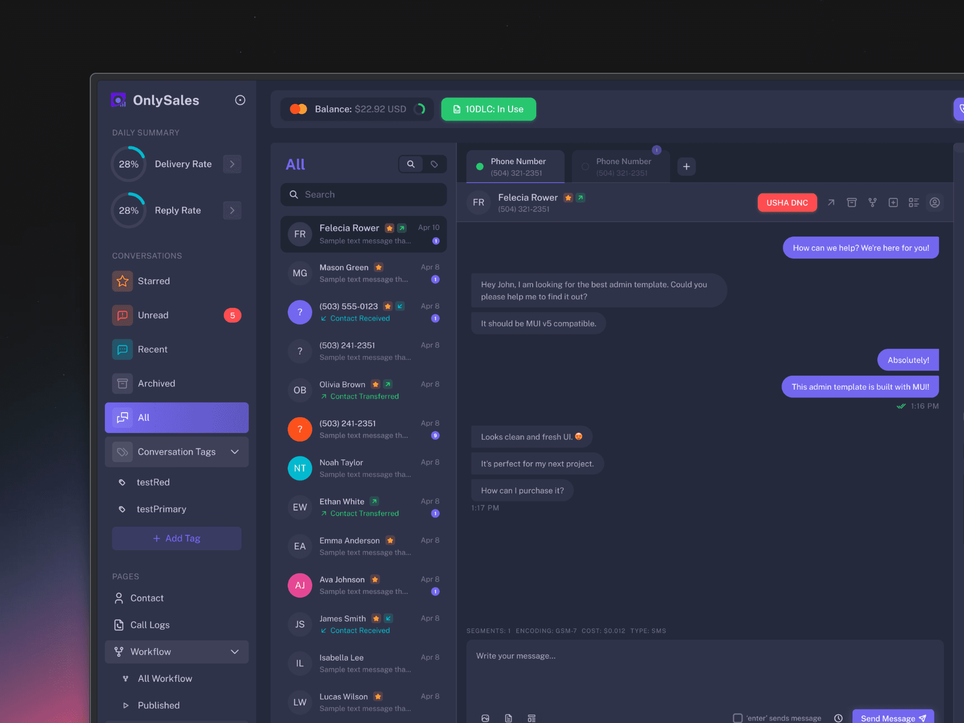
The Reset with Vuexy
Rather than see this as failure, it was used as an opportunity to restructure. The decision was made to pivot once again—this time to Vuexy, a comprehensive admin template with robust component libraries and documentation.
The Vuexy Challenge
When I first explored Vuexy, I encountered a new problem. Its aesthetic felt dated, and I knew our users expected a more contemporary experience. However, I also understood that we couldn't afford another complete overhaul.
The design system, while functional, wasn't particularly modern
The Solution
Strategic modernization through subtle styling changes.

Vuexy Chat Template

Redesigned Template with Styling Changes
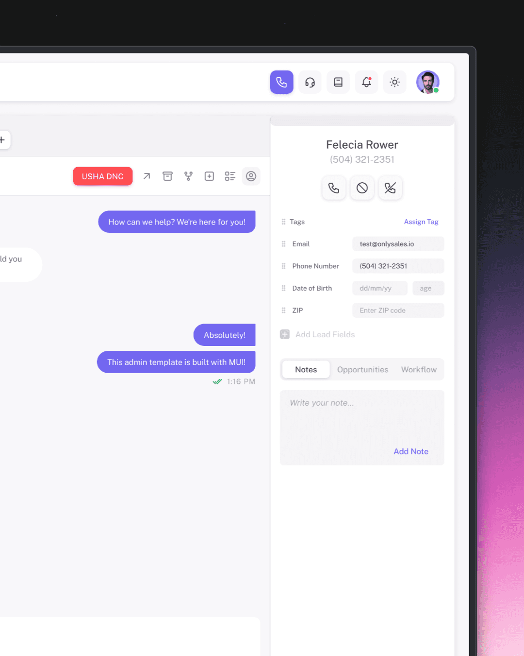
Dark Mode
Working with Vuexy came with a built-in advantage:
The framework already provided a dark mode color counterpart for every element in its design system.
This meant we weren't starting from scratch when it came to theming. But I knew that relying on defaults alone wouldn't be enough. As I designed each component and page, I carefully considered how every detail—shadows, borders, text hierarchy, and background layers—would translate into the darker theme.
Conversation Page in Dark Mode

Workflow Page in Dark Mode
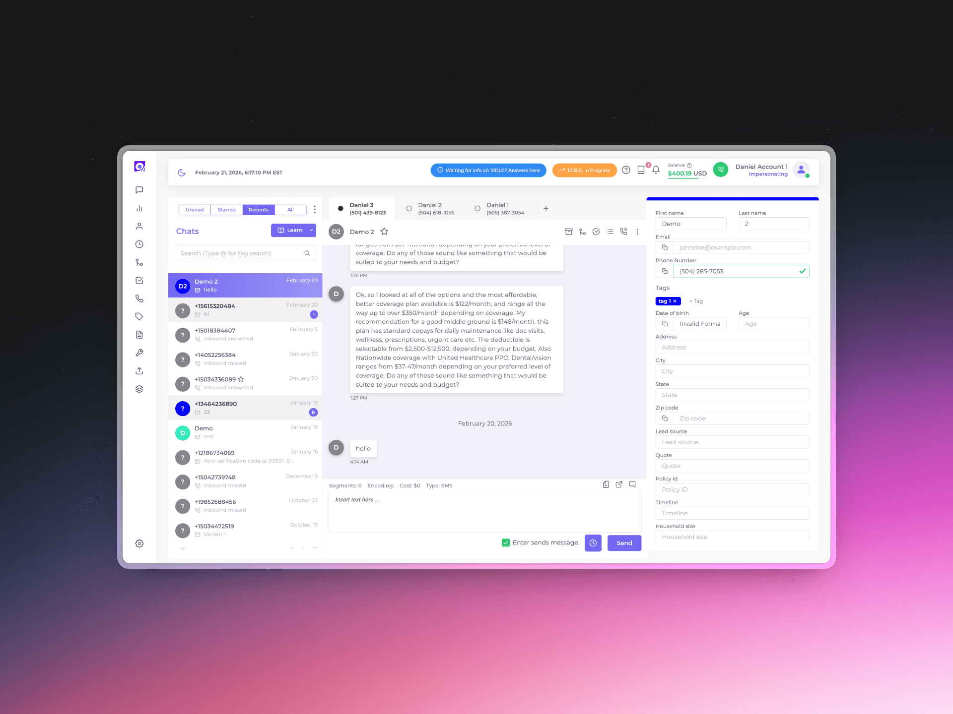
Designing for Real User Needs
Beyond aesthetic updates, we needed to address fundamental usability issues. This required actually talking to our users and asking how they worked.
The Lead Fields Problem
In the previous design, we displayed all available lead fields on the main screen—a comprehensive but overwhelming approach. The interface was cluttered, forcing users to scan through numerous fields to find the information they needed.
Through user interviews and usage analytics, we discovered a clear pattern: users primarily interacted with only 5 core fields:
Tags
Email
Phone Number
Date of Birth
ZIP
The Solution
Redesigned the interface to show only these 5 essential fields by default

Old Sidebar Showing All Fields
Redesigned Sidebar Showing Core Fields
Workflow Page Redesign
The workflow builder had a single generic "Add Action" button. When clicked, it would open a modal card where users had to choose between different actions—sending an SMS or adding a delay. This created an extra step for a simple action.
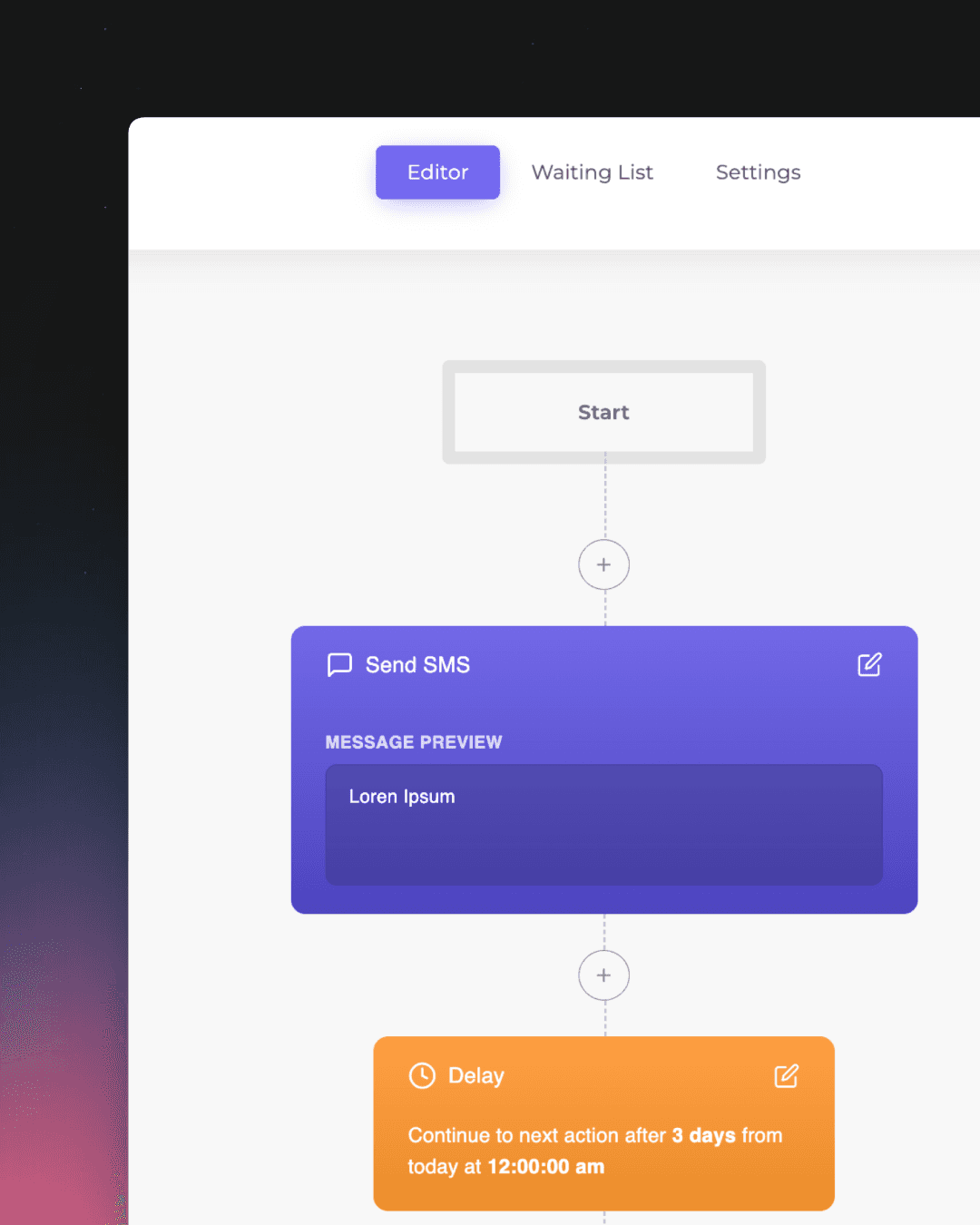
Old Workflow
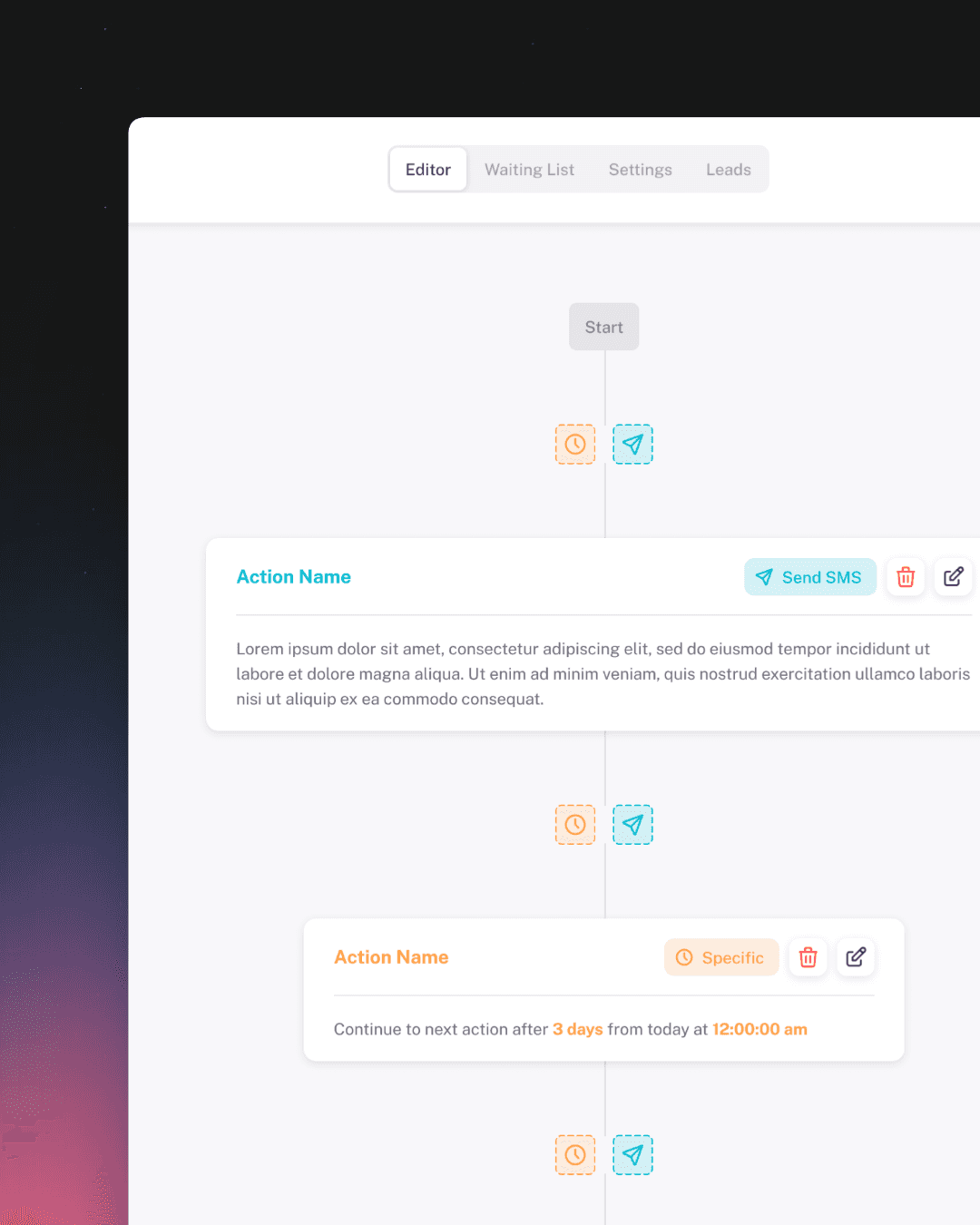
Redesigned Workflow
The Scope of Change
While the examples above highlight some of the redesigns, they represent just a portion of the comprehensive transformation this CRM system underwent. Over the course of this project, I redesigned and improved: